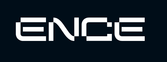
ENCE refreshed their logo
Finnish organization ENCE presented an updated logo and its alternative version. Also the design of the official website has been changed.
"We have worked on this project for the better part of a year - interviewing fans and conducting many surveys to understand better how we can serve our followers better. What you see today is only the first stop in our process to further create digital services to make it easier for you to stay up to date on everything that happens here at ENCE. We have worked together with our partner Bitfactor to build this foundation of a whole new look to what ENCE is today and will be in the future.", says Joona "natu" Leppänen, Marketing Director at ENCE
The main team logo has undergone cosmetic changes, which made it more minimalistic and simple. The name of the organization has disappeared, as well as the number of colors and unnecessary details that prevented recognition when using a logo of small size.
"What you see today is only the first stop in our process to further create digital services to make it easier for you to stay up to date on everything that happens here at ENCE.", says Joona "natu" Leppänen
At the same time, an alternative variant of the logo, consisting exclusively of letters, was presented. It will be used on the official website and in social media. The developers did not inform about which of the logos will be present on the uniform.


Comments