


Gambit performed rebranding
Gambit has updated its logo, team identity, and the official website. The design was done by the Quberten studio, which previously worked with Virtus.pro and Winstrike.
According to the authors of the updated identity, eSports allows experimenting with design, which is impossible in traditional sports.
The main thing that distinguishes eSports from classical sports in terms of approach to design is the youth of the industry. Nobody presses with centuries-old traditions and nothing prevents the organization from visually changing and being relevant in the digital environment, where everything functions.
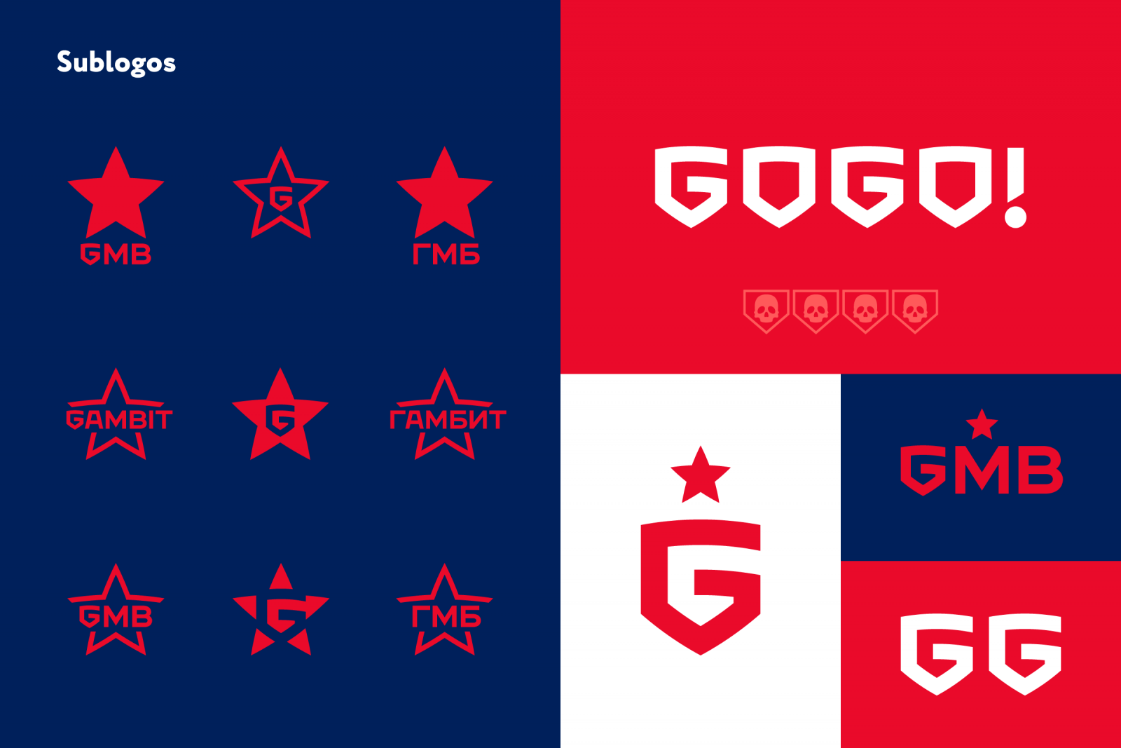
This is just about Gambit. The update has followed the path of delicate restyling, but with a noticeable expansion of corporate identity. The club's identity needed changes, it contained a number of serious problems: a confused logo construction, the absence of an author's star and shield, as well as an important element - branded leatherette. Besides, the club had a lot of elements, made in different styles, which didn't form a whole system among themselves. But even with all the difficulties, we had a lot to repel and make large-scale, but mild corrections.
The designers improved the two main symbols of Gambit - the shield and the star, adding additional meaning in the form of the letter "G". On its basis, a new leatherette was created, as well as a monogram GMB and the inscription GOGO. The logo also received versions of different sizes, which will help to use it in different formats.
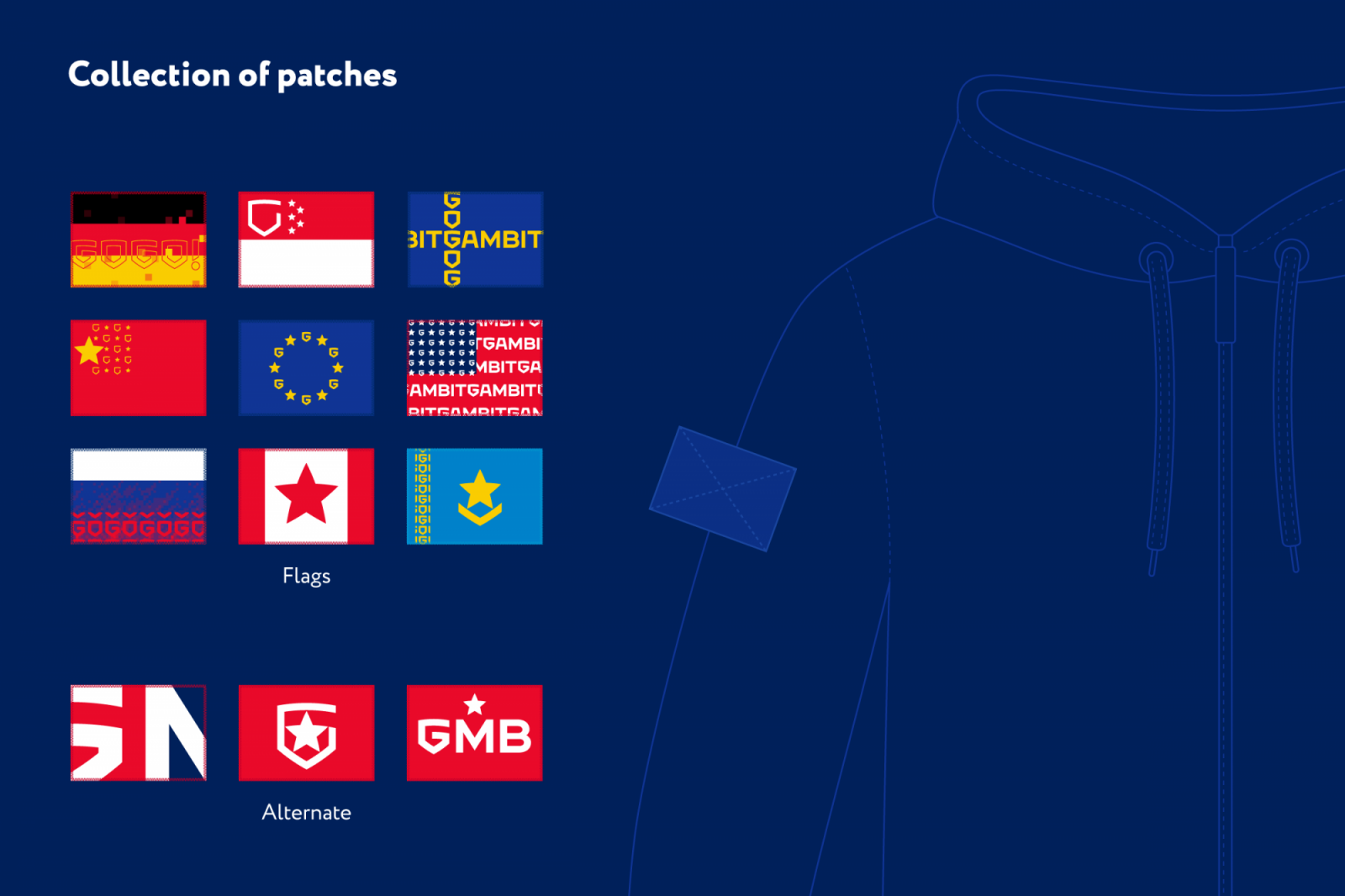
Separately created flags-patches, which are made in the style of symbols of some countries. It is expected that they will accompany the international rosters of the team.


Comments